Robota.ua
Product Design
Contributing to UX research and providing interface solutions to increase the quantity of job listings and active users of the leading Ukrainian job search platform.
About the Project
overviewRobota.ua is one of the leading Ukrainian platforms for searching for jobs, catering to job seekers and companies searching for new employees. Its mission is to link people quickly, easily and with minimal stress. Robota.ua’s main competitor is the recruitment platform Work.ua.
The company regularly conducts research on user needs involving both internal and external specialists. In March 2023 I was invited as a part of a design team to investigate how employers decide where to publish their job listings (Robota.ua or Work.ua). This task arose as a reaction to the fact that there are fewer active employers and job listings on Robota than on Work.ua.
The project period was limited to 1,5 months. We focused specifically on employers posting between 0 and 5 vacancies per month. This selection criterion was informed by the company’s prior research, which revealed that this category consistently has fewer vacancies compared to those on Work.ua.
Desired Outcome
During our initial meeting with the stakeholders, they outlined their specific expectations for our collaboration. Our objectives were two-fold: to research and gain insight into users’ decision-making processes when selecting platforms for posting job vacancies and to propose solutions aimed at expanding the volume of up-to-date content, including job listings and active users on Robota.ua.
project’s framework
Workflow
To guide the project’s progress and ensure a structured approach to problem-solving we followed the Double Diamond framework.
It helped to ensure that each step of the design process was thoroughly considered and that the final product met the desired objectives.
Discover
Define
Develop
Deliver
Client Briefing
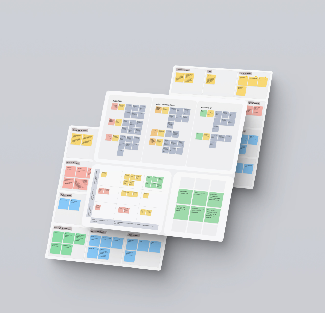
UNDERSTANDING NEEDSIn the initial meeting, our design team asked detailed questions to better understand the product, target audience, key metrics, company strengths, and advantages over competitors. We aimed to find unconfirmed hypotheses, details about conducted research and insights into similar business models.
This collaborative session was essential in shaping the foundation of our design process, ensuring a clear alignment with company goals and a thorough understanding of the design challenges we would face.

In-depth Interviews
understanding needsTo truly understand the needs of our users, we decided to speak with the representatives of our target audience – HR professionals, who post between 0 and 5 job vacancies monthly on job search websites.
Finding the right candidates in a short period was not easy. To optimise our process, we prepared a screener consisting of several key questions and started looking for potential candidates, the largest number of which was found in specialised Facebook groups. As a result, our team managed to conduct 8 in-depth interviews, 3 of which I conducted personally.
All participants had hands-on experience with Robota.ua and its main competitor Work.ua. Through in-depth conversations we gained valuable insight into user behaviour, preferences and pain points. As it turned out, all interviewees struggled with similar issues including irrelevant candidate applications difficulties in processing the applications, etc.
Our findings were synthesised and became a basis for the Value Proposition Canvas with such main goals as:
- Providing a shared visual representation that helps all team members understand the user’s perspective and how the product meets their needs.
- Aligning the features of the platform with the specific needs, pains, and gains identified during previous research.
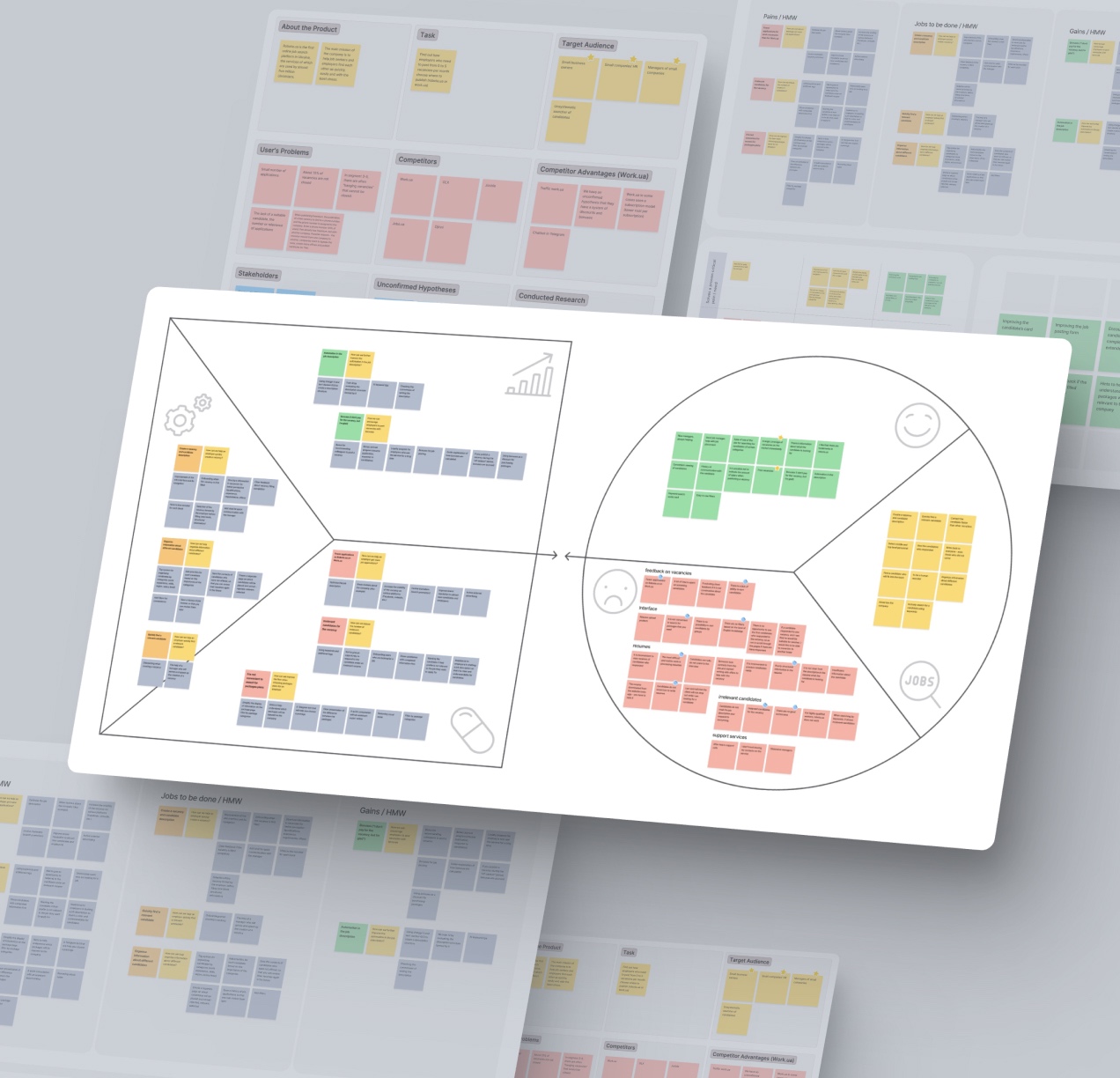
Value Propositional Canvas
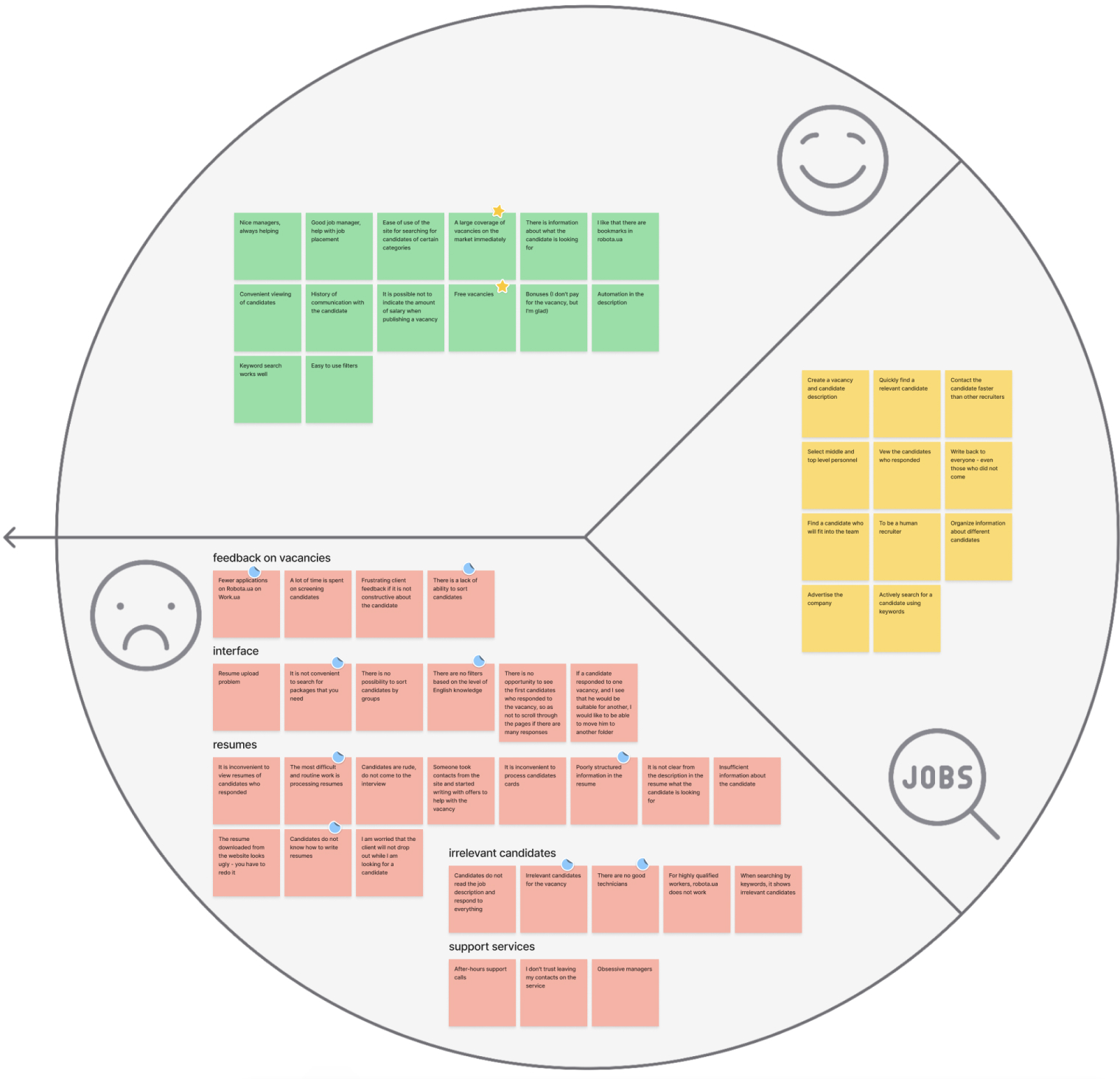
UX mappingIn the initial phase of creating the Value Proposition Canvas, we worked with its right half. We analysed the information obtained during the interviews and divided it into three main categories: gains, pains, and jobs to be done for our users. After that, we decided to group the information related to the difficulties faced by the interviewees, since often the issues mentioned by different people were the same.
To effectively process the received qualitative data, we organised the user pain points into key areas: feedback on vacancies, irrelevant candidates, support services, interface, and resumes. From these categories, we focused on the main pain points that were consistently highlighted by our participants:
- Fewer applications from candidates for skilled labor jobs: Users expressed concern about receiving fewer applications for skilled labor jobs on Robota.ua compared to a competitor’s website.
- Lack of candidate sorting: The absence of a feature to sort candidates was identified as a significant pain point.
- Irrelevant candidate applications: Users found that the candidates applying were often not relevant to the posted vacancies.
- Poorly structured candidate information: Participants noted that the information about candidates lacked proper structure, impacting the efficiency of the hiring process.
After we finished working with the right part of the canvas, we moved to the left. During a team workshop with the “How Might We” technique, we generated potential solutions to enhance the user experience. All the ideas were used to complete the Value Proposition Canvas.
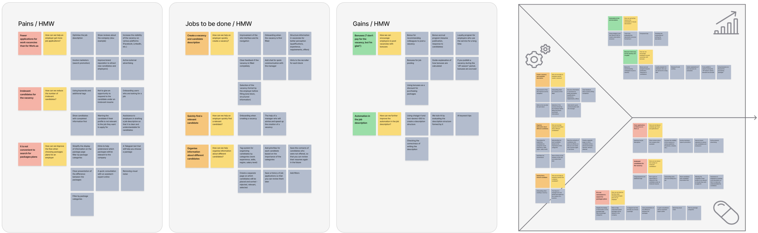
We evaluated each idea based on its potential value and the effort required for implementation in order to decide which of them we should work with further.
At the same time one designer from our team had to take a break due to personal reasons and we remained a team of two. Because of the limitations in time and resources we decided to develop only the ideas which could be easily done by our team and solved a proven critical pain need. They are presented in the upper right corner of the diagram below.
Challenges in Candidate Information
problems & solutionsOne of the main problems we addressed was that employers do not have enough information on candidate’s cards on the website. That is because of two reasons:
- Card’s structure – the information presented on the card is very basic, and to see the important data and full applications recruiters have to go to separate pages which slows down the search process;
- Poorly filled resumes on the platform – candidates often do not fill in the information in all fields, this is as we assumed, due to a lack of motivation or knowledge of what to write.
The employers we interviewed mentioned: “insufficient information about the candidate”, “the percentage of completed resumes is very small”, “it is inconvenient to process candidate’s information”, and “candidates don’t know what to write in their resume”.
We hypothesised that if a recruiter has more information about candidates on the page with all the applications, then they will be faster to choose those who are relevant for a specific position.
I was fully responsible for the development of the following design solutions:
- Improving the candidate’s card.
- Encouraging candidates to complete a full and extended resume.
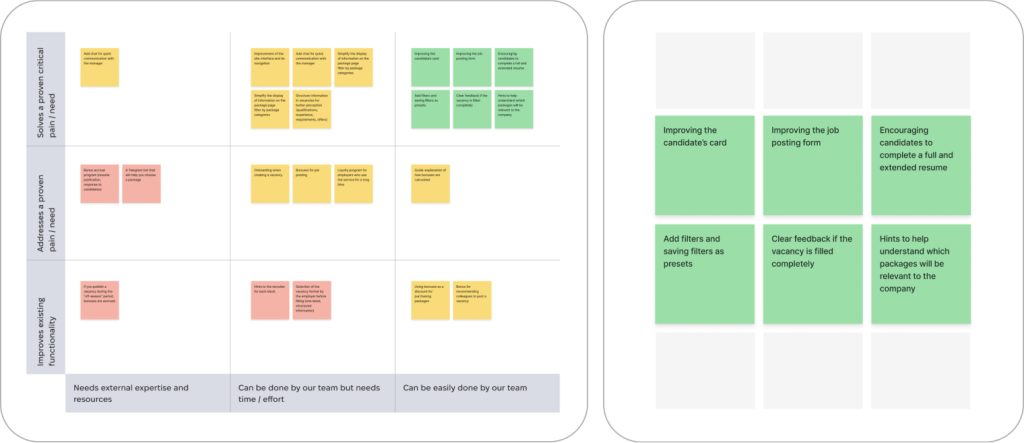
Improving the Candidate’s Card
As it was important to our target audience to quickly learn more about the candidate and decide on the next steps fast, I redesigned the candidate’s card in such a way that all the crucial data is presented. To understand what was crucial, I was guided by the needs of the users, which they expressed during the interviews. The most important elements for the recruiters were position, amount of the desired salary, and years of work experience.
To go even further with improving the card I added two options – to show an insert from the cover letter of the candidate, or the recruiter’s note (if there is one already). These changes were planned to be tested with the users.
Also, I added the possibility for the recruiter to see if the candidate is online, which had to speed up the process of first contact with the candidate.
During the interviews we learned that most recruiters are not interested in the candidate’s age and that users were confused by duplicated action buttons on the candidate’s card. For this reason a decision was made to remove this unnecessary information.
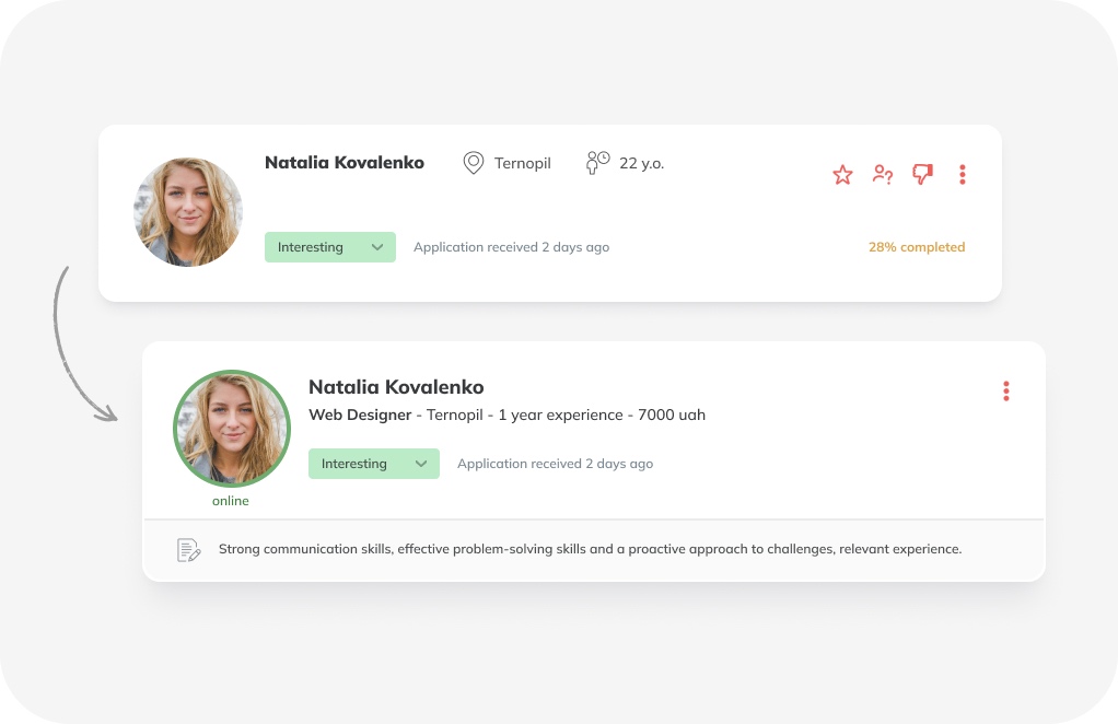
Encouraging Candidates to Complete a Full and Extended Resume
Since candidates often don’t know what to write in a resume and how to structure information, we suggested helping them with informative and motivational tips.
Although such tips were already on the site, we suggested expanding them with explanations on how to write more meaningfully and point out the advantages of having a fully-completed information block.
Processing of Candidate Applications
Recruiters spend a significant amount of time screening candidates, as it is necessary to analyse each application in detail and weed out those who don’t meet the vacancy requirements.
We hypothesised that recruiters would spend less time working with candidate cards if we allowed the candidates to be grouped. To achieve this we suggested three solutions:
- Filtering the applicants.
- Saving filters as presets.
- Redirecting applications.
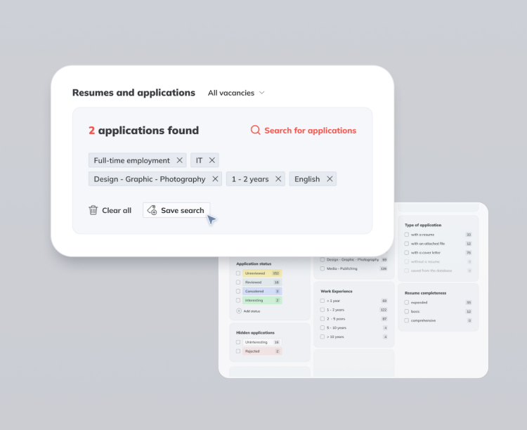
Filtering the Applicants
The aim here was to give the possibility to the recruiters to make the workflow more efficient, specifically when analysing the applications. This was done through reusing filters taken from the existing page “Resumes” while adding new categories, based on the information collected during the in-depth interviews. Categories within these filters were expanded to include:
- industry in which the employee previously worked;
- work experience;
- type of employment.
We also decided to show selected filters that are relevant to the vacancy and depend on the industry and type of employment.
Saving Filters as Presets
One other feature was the possibility to save filters as presets on the “Job Reviews” page and reuse the functionality from the “Resume” page. This solution works as a supplement to the “Filtering the Applicants” as it allows employers to have a flexible system for candidates screening.
Redirecting Applications
It was vital to provide an opportunity to redirect applications of promising candidates to other vacancies created by the company. We proposed to add the “Move to another vacancy” button in the existing dropdown.
Improving Job Posting
It was highlighted that recruiters partially fill the vacancy and don’t provide all the information, therefore candidates whose applications are irrelevant often respond. During the in-depth interviews, our respondents indicated the following pain points: “Vacancy for a specialist with experience – a student responds”, “management help is often needed when creating vacancies”, and “I don’t understand how to fill the vacancy 100%”.
We hypothesised that improving the convenience of the job creation process on the Robota.ua platform would reduce the time it takes to create a job and increase the number of appropriate candidates. The proposed solution was to improve the job posting form.
Improving the Job Posting Form
- Simplify and clean up the page design for a clearer and easier understanding.
- Add a choice for job placement category to increase the number of relevant applicants.
- Add an option to automatically fill in the field with contact information about the company.
- A better placement of the tips in the corresponding block to encourage users to fill in the relevant information.
- Add a block with candidates’ education and experience to increase the number of relevant applicants.
- Add a vacancy-filling quality indicator to encourage employers to create more specific and more detailed job descriptions.
Usability Testing
As a part of the project, I conducted 3 usability testing sessions with recruiters where recruiters interacted with the prototypes. The most positive feedback came from the improved candidate cards and filtering:
- Improved candidate cards. Recruiters found the increased information on the cards to be highly valuable, providing a more comprehensive overview of each candidate. The inclusion of brief cover letter content was particularly appreciated, as it offered deeper insights into candidates’ motivations and qualifications. All participants expressed a clear preference for the new candidate cards over the old ones.
- Filtering functionality. Recruiters noted the effectiveness of sorting candidates, which allows them to quickly identify suitable profiles.
Presentation & Feedback
During the presentation to stakeholders, they especially appreciated that the proposed solutions didn’t require significant changes in the development process.
Among the most successful solutions in their opinion were: improving the candidate card, encouraging candidates to complete a full and extended resume using the motivation tips and filtering the applicants. Stakeholders expressed their readiness to implement the proposed design solution.